Even if your participants aren't interested in comics (and sadly there are such children out there), this could be applicable to composition of other images, and many kids feel they have learned a real practical technique with this one, which is what they like. Saying that, some kids are already fully aware of how to depict depth in their drawings, so I tell them it's a good reminder to reinforce their skills.
So, this exercise is about getting ourselves past this kind of arrangement of elements -
 - where the background is up at the top and everything else is laid out in front of you like on a table. At Y6 level some kids still put a blue sky stripe (and yellow sunshine) across the very top of every drawing - a difficult habit to get out of it seems.
So how can we make our drawings more realistic, capturing the 3-dimensionality and depth of field of the world around us?
A4 paper handed out, on the board/flipchart I draw their sheet and where I'd like them to roughly and lightly draw 2 dotted pencil lines - one halfway down, and another dividing the bottom half into 2 again (no need to measure or be exact, and don't bother with rulers).
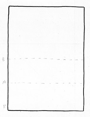 Label these lines with a B for Background, an M for Midground, and the bottom space is what we are going to use for our Foreground, so label it F.
In pencil, I start to construct my picture on the background line, adding backgroundy things; here a volcano and palm trees, though I encourage everyone to think of their own backdrop, whether it be forest, cityscape or whatever -
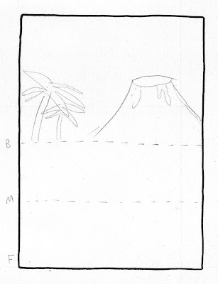 I'll give them maybe 2 minutes to do each of these stages, emphasising that we are just working in pencil for the time being, so keep it light, rough, and don't bother with intricate details like windows on towerblocks.
With everyone up to speed, I show how next I add midground elements to my picture. Again, think of your own elements or just copy mine if you are stuck for ideas -
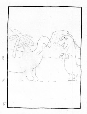 The important thing here is that I'm drawing OVER THE TOP of my initial background drawing - my midground is OVERLAPPING the background. This will really puzzle a few, so I make sure I go around at this point to make sure everyone's overlapping. I explain that it might seem strange to be piling this drawing on top of the first one, but if we don't then we won't get the final desired effect. We also have a quick conversation about how these M elements are closer to us and will therefore be larger than if they were in the background.
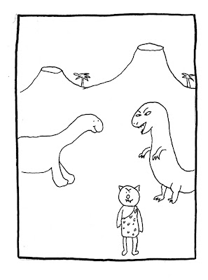
Now once we are all done, I demonstrate adding my foreground element. As we are making a comic image, what are we likely to have in the front of our picture or panel? Hopefully someone will suggest character or characters -
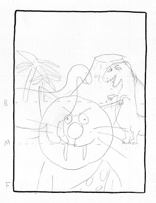 Again, we are piling another drawing on top of the others here, making sure it OVERLAPS. If your drawing isn't looking messy then you might be doing it wrong! Now I explain that I want this sabre-toothed cave cat to be right at the front of this image, nice and close, so rather than draw him in full head-to-toe figure, I'm going to bring him so close that we can only see his head and shoulders. Can you see all of the person sat nearest to you? Probably not.
Time to hand out the black felt tips, and make some sense out of our spagetti-mess drawings. I ask WHERE on the drawing should we begin inking? WHY the foregound first? What might happen if we start inking the background scenery first? Kids start to get it now. I demonstrate -
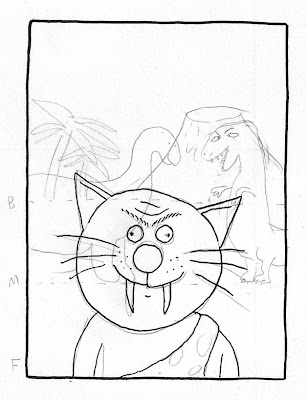
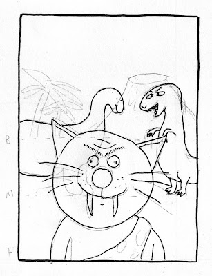 Only once we have inked our foreground character should we start working our way back through the drawing. Where my cat overlaps the dinosaurs, I need to make sure that my felt tip only picks out the parts of the dinosaur we can SEE. Sabre-tooth cave cats are not made of glass and we cannot see through them, therefore as we ink,we need to be constantly aware of what is in front and what is behind.
I'll give them no more than 10 minutes on this part, and I go round everyone to give a little guidance. Usually about a third of them will make a bit of a mistake and ink parts that should be hidden, but that's how you learn. Remember these drawings are about learning a technique, not getting it perfect - these will not be going on the wall or anything, so don't worry if you've done a bit wrong, your next drawing will be better.
Having done this exercise once, you'll find that with your next attempt there's no need to draw the initial dotted lines as you'll just know whereabouts to place elements on your picture. And of course, this isn't how you would compose every picture - it's only appropriate in certain instances. What it is though, is something that might prove useful when you are struggling with how to establish a scene or place, acting as a reminder of one way that you could go about it.
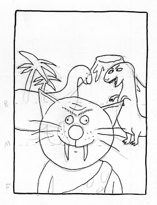 OK, so I'm pretty happy with this drawing, especially compared to my previous attempt where nothing was overlapping which meant we had no sense of depth. I'll go to the other side of the room and have a look, and find it's good but there is still room for improvement as I'm struggling to make out what is going on.
I show a quick optical illusion - two birds flying -
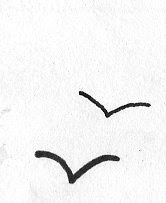
- the class will usually agree that the bottom one looks closer as the line is thicker, even though they are both about the same size. This is how to use this to our advantage -
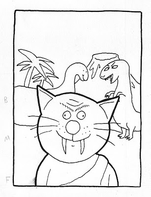 - adding a thicker outline around our foreground element brings them even further forward (think of the Powerpuff Girls and any number of cartoon characters). We can take advantage of the opposite effect by using thinner lines for inking our background elements, creating a stronger sense of depth.
This exercise flows neatly into number 5 - black and white contrast. Next.


1 comment:
This is great stuff. I'll use this in my own drawing as well as in a workshop. Much appreciated.
Post a Comment