And sometimes I'll find myself talking about how artists often use the fact that we read (both words and images) from left to right, and use it to subtly make their story (or 'information') clearer or more explicit. I think I probably became aware of it myself having read 'How to Read Nancy' by Mark Newgarden and Paul Karasik, which unpicks the visual mechanics of Bushmiller's deceptively simple creation -

Just about every Nancy strip I've ever seen has begun with her walking into the story left to right, just as you the reader are doing, leading you smoothly towards the next panel - before you even realise it you've read the whole story (I've a quote somewhere that I will post as soon as I find it, that essentially says that Bushmiller makes it impossible to look at the strip and NOT read it).

He is also very skilful at halting this flow when the story calls for it - usually at the end or punchline - by turning Nancy or another character to face to the right. Visually this acts as a kind of punctuation - stop reading here. In the traditional newspaper strip format this is especially useful, rounding the story off and making sure you don't start straight into Dilbert or Garfield without an appropriate pause.
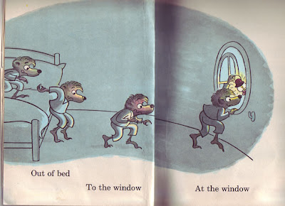
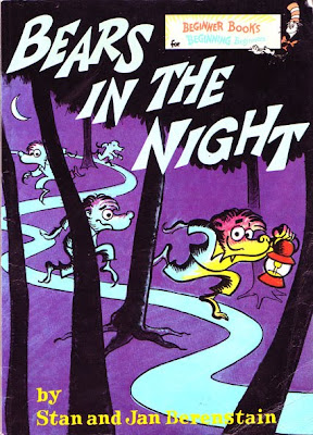
Since I became aware of this manipulation I've noticed it everywhere, in comics and childrens books. For example, The Berenstain's Bears in the Night, which structurally hangs on you identifying and relating to the cubs, following alongside, being visually confronted and startled by the owl, then turning back on yourself and racing back in the opposite direction.


In a strange way, the cub racing right to left, against your natural inclination to read the page left to right, has the effect of making him race faster, like being on a moving train as one passes in the opposite direction. The cubs haste here is not just created by the cartoony wooshlines and dustclouds, but also your eye travelling across the spread.
A procession depicted moving right to left also seems to work visually better than the other direction - we feel more like spectators stood watching it flow past -

- if for whatever reason we wanted to create an image of a procession that we want the reader to be immersed or involved in, then depicting it travelling left to right will make the reader move in the same direction.


2 comments:
Hi Jim,
this is really great theory/teaching work - picking up on things we should be/are doing instinctually.
Have you ever thought of doing a book? A kind of simpler, child-friendly version of Scott McCloud's Understanding Comics?
I agree, you've certainly got the skills to pay the bills, Jim.
Post a Comment